posted January 18, 2019 #
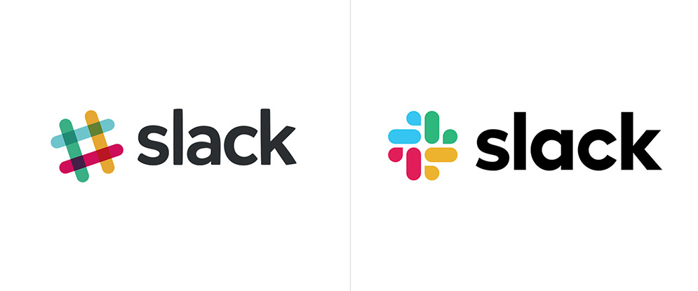
Presumably everyone noticed the new Slack logo this week but no rebranding would be complete without a breakdown from Brand New. So, here it is!
Hash It Out breaks down the choices made in the new design, how they feel they work together and a few examples of them being used in various campaigns. I loved this little bit:
The main problem with the new icon is that it is not the old icon which I know is a dumb statement to make but it’s the number one reason people will not like it, which, in itself, can be a dumb reason to discredit it.
That sentiment actually applies to most rebranding exercises - anything new is almost always immediately shat upon. But I digress. It's a nice fun new mark and I'm not heavily opinionated on it being lightyears better or worse; it's just an interesting change worth noting.