
Dear iTunes 10, Why?!
posted September 3, 2010 # 0 Comments
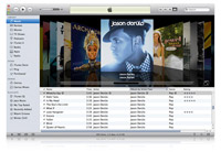
I think it's safe to say that whenever software you regularly use receives a significant UI update there will be a negative response just because it's different. So, when I downloaded the new iTunes 10 I was fairly sure that I was going to have some hangups about changes they made. I was right. It also seems like I'm not alone. Plenty of people are not digging the monochrome color scheme, the vertical system window buttons, the terrible check marks, the new icon, the tiny artwork or the incredibly awkward Album View with floating album titles. But what to do? Just be disappointed or take some action?
I dug through all the preferences and got the functionality back to a semblance of what I was used to but it wasn't until I was sent a link to iTunes 109 that I really got it back to a place that felt comfortable. The software puts the color back in your icons and fixes the system window buttons to be in the proper horizontal format. It's a small step but it's a helpful one.
As for Ping - I haven't even signed up. I hear it's an aggregator for your iTunes Store activity and, frankly, I don't really procure any music through iTunes so I don't know why I'd use it!
I dug through all the preferences and got the functionality back to a semblance of what I was used to but it wasn't until I was sent a link to iTunes 109 that I really got it back to a place that felt comfortable. The software puts the color back in your icons and fixes the system window buttons to be in the proper horizontal format. It's a small step but it's a helpful one.
As for Ping - I haven't even signed up. I hear it's an aggregator for your iTunes Store activity and, frankly, I don't really procure any music through iTunes so I don't know why I'd use it!