posted October 14, 2014 #
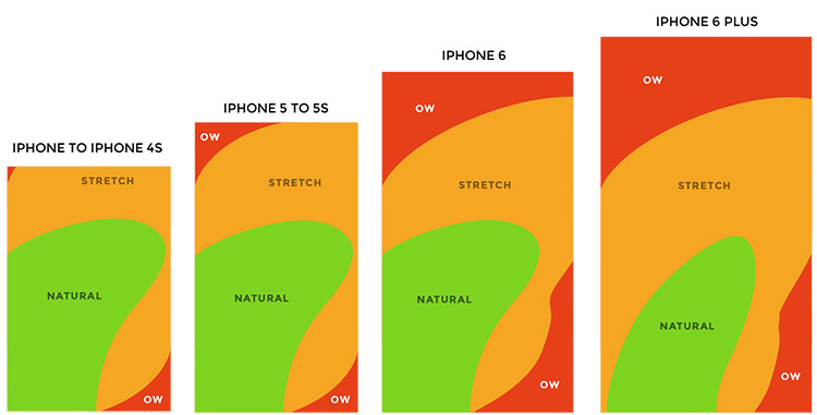
Obviously the era of "Mobile First" for design has really set a foothold in the world of web creation but it never hurts to get a healthy reminder of the type of interaction and audience you're dealing with when using smaller screens. Scott Hurff's
How to design for thumbs in the Era of Huge Screens is a great read regarding the enormous screen areas we're dealing with now and the thumb stretch involved with hitting pertinent content. A hamburger menu in the top left on an iPhone 6+ is pretty much unreachable. So, what's the solution? Great question and not one that I have the answer to offhand.