posted August 18, 2017 #
I'm barely a novice in the realm of data visualization but I
do know that I enjoy this
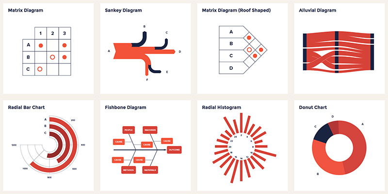
Data Viz Project from
ferdio (an infographic company). There's something compelling about the playfulness and simplicity of the graphics that makes it more intriguing to parse the information out of them. Maybe that's just me but I've stared at my fair share of boring Google Sheets diagrams and this certainly seems better.
Long story short, here's a bunch of charts and graphs that are well designed and maybe, just
maybe, will become a toolbox for actual real world usage someday.