Turns out, Google sent a lone employee to Hashima Island, aka Battleship Island, aka an extremely inhabited coal mining facility that was completely abandoned in 1974 to implement their 9 Eye'd Google Map to the facilities.. Japan seems to have no shortage of crazyislands but I digress.
The video sets the scene for how the mapping was done but it's probably best to just dive right in. The experience is, obviously, not quite the same as walking through the structures itself but it's still a compelling journey.
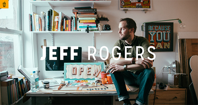
Very happy to see that Draft & Draw is happening again. The third installation (event: June 6th, tickets: May 28th) features Jeff Rogers speaking on his craft and the standard issue custom pint glass, pizza, beer and comradery. I was fortunate enough to attend the last one and am rather looking forward to this one. Don't sleep on getting those tickets! If you can't attend, follow along on Instagram.
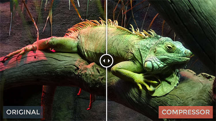
I'll be frank, the pitch behind Compressor seems torn straight from the pages of Silicon Valley. A compression engine that minifies image files to sizes beyond your dreams with no quality lost! I mean, seriously, is this viral marketing? The demo behaves as you'd expect and it seems like one of those things that is too good to be true but isn't. Who am I to doubt it? Guess the next step is to find out how to implement it on existing images without a reupload.
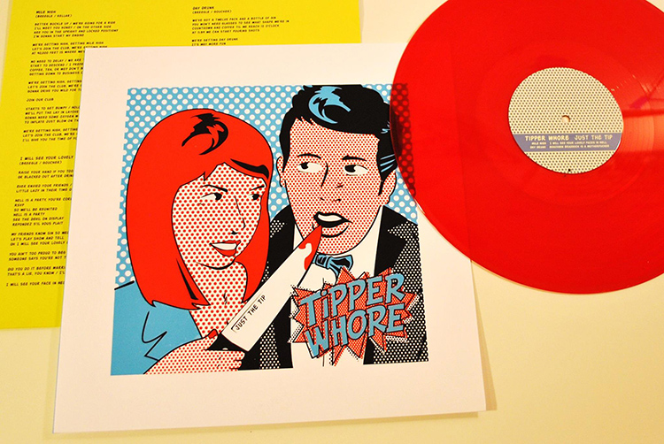
Today is the official release for the Tipper Whore release, Just the Tip. The songs are loose, ridiculous, crass and, above all else, fun.
The physical LP is a clear red encased in hand screen printed artwork designed by myself and printed at Grand Palace. If you're in the Nashville area, they're already for sale at Grimey's and The Groove. If you're not, you can snag one on the Internet - where else!?
The album will arrive on all your favorite streaming services later this week but, for now, you gotta hear it at Bandcamp or Soundcloud.
I am an unabashed fan of (version) industries. They work with great artists, great consistently compelling visual works and, without taking much credit, help create landmark sites like Louis CK's. So, it was quite a treat to see this excellent interview with co-founder Giles Copp. He speaks to their choice in clients, the lessons he's learned from working with the entertainment industry and how he feels about PHP (spoiler alert: he's a fan). It's nice to read a conversation that hits that right balance of easy and eloquent. Would love to hear more from Mr. Copp.
I must admit, if I had to pick an airline company that I thought might shake things up in terms of progressive design and thoughtful user experience my bet would likely be on Virgin America. Their current site is pretty much as stale as every other airline out there but their forthcoming beta is about as slick as it can get. Check out the tour to get a sense of all the changes - they even went as far as adopting worthwhile boarding pass designs (sound familiar?).
I must admit, it makes me curious to actually book with them...
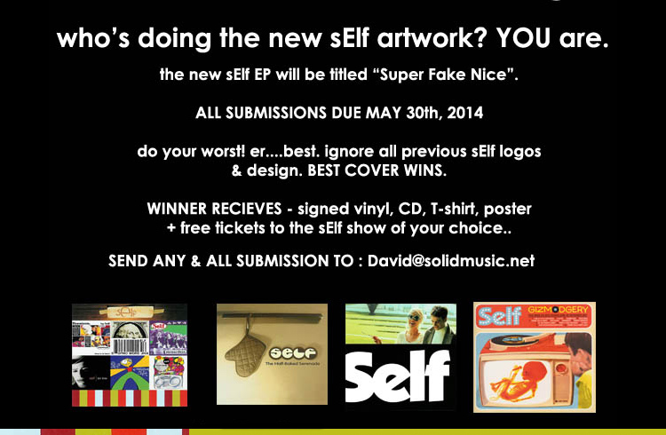
The deadline is tight but if you're interested in helping out Self put together artwork for their forthcoming EP, Super Fake Nice, you can be part of the band's history. In fact, the request is to even ignore all previous logos and design aesthetic and go bonkers. If you follow
Trying something a little different this week. No permalink on the playlist - you wanna watch it, just click that gif and watch it here! Not that crazy but different enough for me to make note of.
Enjoy this playlist.. there's plenty of amusingcontent out there for you to enjoy, but I selected these in particular:
Hey Cat. Hey - let's start simple. Just a cat saying Hey.
The Spielberg Oner - kind of hate the term "oner" but this look at Spieldberg's use of long, continuous shots is nice. You don't think of him as using such a technique but that's just evidence of how good he is at it.
BUTTS - sometimes it's easy to cheer up a friend. Love the moon at the end.
"Her" Parody with Steve Brule - yes, these parody videos are highly overdone but the Steve Brule chortle gets me every time. I can't help it.
John Lewis 150th Anniversary - a very Wes Anderson-y commercial featuring Gaz Coombes singing a classic Kinks song. Hard not to like.
Broad City: Do The Right Thing - if you haven't watched the web series version of Broad City, you're missing out. This takes a good 3 minutes to really kick in but the reward is worth it. Stick with it.
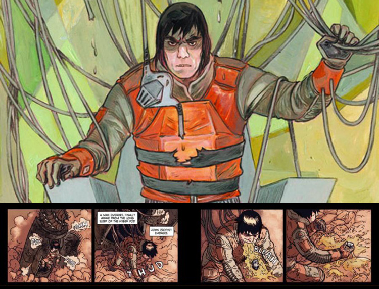
I just finished reading the first volume of Prophet from Brandon Graham and can't stop thinking about the story that's been put forth. The artwork comes from a myriad of artists, the overarching story doesn't reveal itself entirely and the writing lets you make assumptions without spelling it all out. Beyond that, it's filled with gorgeous other worlds and intense alien beings.
I can't think of a proper way to make the recommendation for a piece of work that doesn't put its story out front and center.. nor do I really know how to properly reveal a piece of work that is largely visual. I'll just say, please read this.
Having grown up during the time of the release of the Nintendo Entertainment System I wasn't exactly privy to all the in's and out's of the business going on behind the scenes. It wasn't until years later that I found that that Nintendo, the company, was actually founded in the late 1800's. So, reading this excerpt from Console Wars, The Rise of Nintendo: A Story in 8 Bits was incredibly eye opening. Reading about the pitfalls of the company and how it was able to establish itself through a handful of characters was quite engaging, to say the least. I look forward to reading the entire book but am now firmly entrenched in my fascination with learning more about Shigeru Miyamoto - as his role in the success of the NES was absolutely clutch.
Big thanks to Grau Lackey and Bronson Zgeb for creating this Generate a Cat Bot - a generative Twitter bot that creates an 8-bit feline for you if you follow it and tweet at it. The above is my cat. It is a silly thing but I find it delightful.
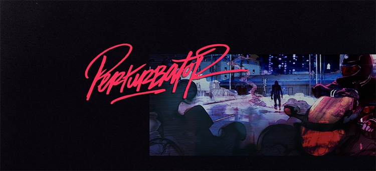
The name is awful but, despite that, the site for musician Perturbator is a fun experience. There's a pulp-y element to a lot of the art and some pretty forward thinking web design tricks to display traditionally boring information (check that Discography Cube). All of the actual music is on Bandcamp and Soundcloud but you really need to start with the site. Even something as subtle as the static bg on the Contact page is worth making mental note of.
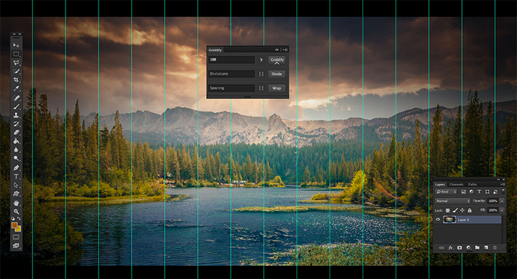
This Gelobi tool, Griddify, looks like an incredibly solid tool for quickly and easily creating grid markers in your Photoshop document. Seriously painless experience. However, I'm way more impressed by their presentation method of the actual product. Click play on this introductory video and behold! as it takes over the entire page and fake reveals some HTML. Very clever move.
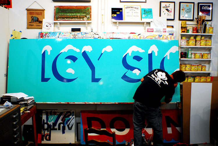
Thanks to an Instagram post, my interest became piqued regarding the work of Stephen Powers and his shop, ICY Signs.
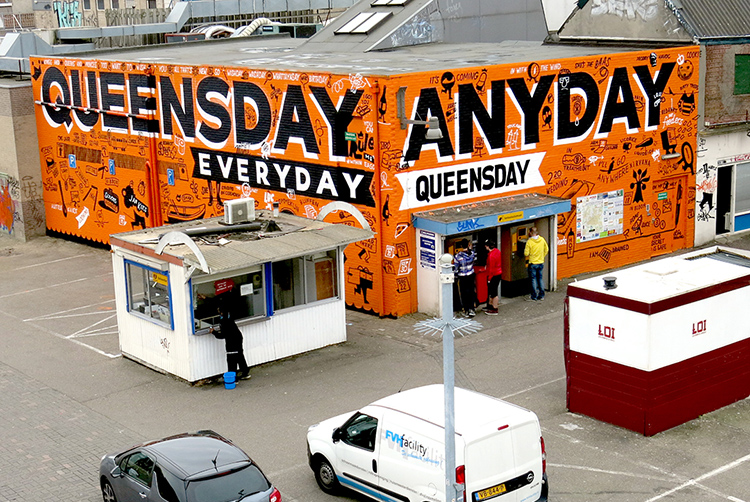
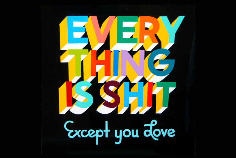
I'd seen his massive public works in downtown Brooklyn but hadn't ever pieced it together that there was something bigger going on. Diving into his site, First and Fifteenth, opens up a massive world of links - art projects, blogs, fine art pieces and plenty more. It's actually a bit overwhelming.
Fortunately, this Bklynr piece - Stephen Powers Puts the Writing on the Wall - is an excellent entry point. From his roots as a graffiti artist tagging ESPO wherever he could, to trying to bridge the gap from street art to high art, to how he functions integrating a community in a public piece.. it's all there.
After reading the above article and immersing myself in his multiple sites, I subscribed to all the blogs, the mailing list and want to see his work in all the neighborhoods I visit. In other words, I'm a fan. Can't believe it took me this long to come to it.
I still keep up with a good bit of musical happenings in Nashville, despite having relocated to Brooklyn. I can't help it! If I didn't, I'd be missing out on new goodness like this via fro Pale HousesWayward Sire. Director Seth Graves did an excellent job creating a compelling piece of work through some dramatic lighting, some fog, a few meandering actors and a solid song.
Oh, and Ryan Rayborn is one of my favorite drummers to watch and this video features plenty of that.
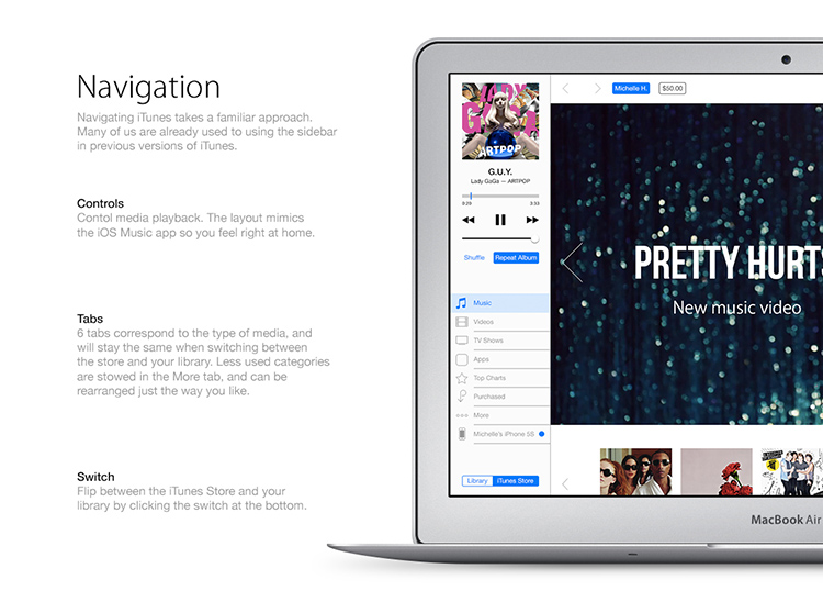
I can't say that this iTunes redesign is perfect but it does seem like a step in the right direction. Many may roll their eyes at such longform experimental design overhauls - as they are often more style than substance - but it's always worthwhile to look at alternate undertakings, particularly with a product as overwhelming as iTunes has become.