Dear iTunes 10, Why?!

posted September 3, 2010 #

iTunes 10
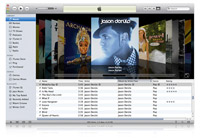
I think it's safe to say that whenever software you regularly use receives a significant UI update there will be a negative response just because it's different. So, when I downloaded the new iTunes 10 I was fairly sure that I was going to have some hangups about changes they made. I was right. It also seems like I'm not alone. Plenty of people are not digging the monochrome color scheme, the vertical system window buttons, the terrible check marks, the new icon, the tiny artwork or the incredibly awkward Album View with floating album titles. But what to do? Just be disappointed or take some action?

I dug through all the preferences and got the functionality back to a semblance of what I was used to but it wasn't until I was sent a link to iTunes 109 that I really got it back to a place that felt comfortable. The software puts the color back in your icons and fixes the system window buttons to be in the proper horizontal format. It's a small step but it's a helpful one.

As for Ping - I haven't even signed up. I hear it's an aggregator for your iTunes Store activity and, frankly, I don't really procure any music through iTunes so I don't know why I'd use it!

Frank Lloyd Wright Homage

posted September 2, 2010 #

Chillout: Frank Lloyd Wright
It's unfortunate that this incredible miniature is associated with a compilation called Chillout Sessions but enjoyable creations often come from strange sources. Art director Andrew van der Westhuyzen did a phenomenal job of paying tribute to Frank Lloyd Wright, 1950's aesthetics and creating a little world that goes right along with the music on the disc (however unfortunate the title). Be sure to watch the promo video that goes along with it as it provides a nice insight into the little world that's been created.

Via Courtney.

Mimesis

posted September 2, 2010 #

Barbara and Michael Leisgen
There's an overly arty description of the works of Barbara & Michael Leisgen in regards to their Mimesis series but lets be honest - it's a clever group of images with the subject seemingly interacting with / accentuating the background, often times melding with it. Maybe it is a "counterpoint to conceptual photography" during the 70's or a statement on the human condition but I'm content with just enjoying the images.

Via Jessica.

Top Tail Zoo

posted September 2, 2010 #

Top Tail
One assumes this Top Tail Zoo series of images is culled from some cards intended for children to create their own pairings of situations between various zoo / non-zoo animals. Sounds innocent sure but then you get pairings like this or this or especially this and you quickly start tumbling down into a much more terrifying realm of creation. I do not want to envision the situation where this could be a reality.

via Eli.

Richard Colman Art

posted September 2, 2010 #

Richard Colman
There's an element to the works of Richard Colman that reminds me Marcel Dzama in a slight way - mostly the character depiction - but that's just enough to draw you in, a vague familiarity that pulls you into a pretty chaotic world. I love all the uses of coffins and repeated shapes. I'd particularly enjoy seeing this in person as I feel like there's a level of detail that can't be appreciated via the Internet.

Via Jeremy.

Josef Schulz Formen

posted September 2, 2010 #

Josef Schulz
A lot of the works from Josef Schulz have a nice simple elegance to them. You probably know him best for his Sign Out series of the corporate signs with all the identity work painted out but seems almost kitschy when compared to his Formen or Terraform series. I've a feeling there's a great deal of manipulation going on but it's a nice subtle manipulation that works.

Via Drudgeons.

Mcbess

posted September 1, 2010 #

Mcbess
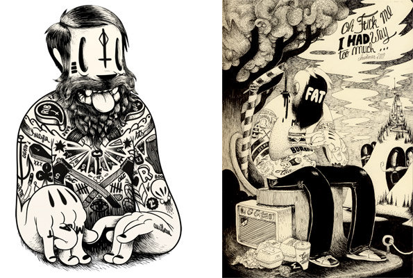
I think it's safe to assume that I've encountered the work of Mcbess before... possibly a KN Wallpaper or some other source but it wasn't until now that I really dug in and spent time poring over the portfolio, listening to his band, watching his amazing videos or scouring the blog. The vague familiarity of style to the old Disney cartoons is a nice base for the slightly rougher edge of the characters being presented. I really can't get enough of looking at all the nooks and crannies of his illustrations to find some great subtle tattoo or recurring theme worked in.

Many thanks to Messes of Men for the reminder heads up that I really should be keeping up with all possible web presence from Mcbess.

Works By Fred Herzog

posted September 1, 2010 #

Fred Herzog
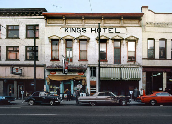
I'm sort of at a loss for words with the works of Fred Herzog. Actually, the words I would use are along the lines of: stunned, engaged, enamored and even baffled. His documentation of Vancouver and surrounding cities in the 1950's reveals some unbelievable images. Even the simplest snaps seem to tell a story and have a color palette that you just don't encounter that often.

As usual, thanks to Kate for sharing.

Quickly Now - Link Hodge Podge

posted September 1, 2010 #

  • GMail Priority Inbox - apparently Gmail is launching a new sorting method to bring your most relevant emails into a more visible view. Has this been activated for you yet? How's it working out?
  • Silent Uproar Records Sampler - looks like the boys over at Silent Uproar put together a mix of their artist catalog.. it runs a wide variety of styles but I suggest you put your ear to the ground with the Codaphonic, Feersum Ennjin and Capulets tracks; hard to miss with those. Oh, and nice new logo guys.. liking it!
  • Album Tacos - yes, I have seen it.. and yes, at times I think it's hilariously brilliant.

Absence of Water

posted September 1, 2010 #

Gigi Cifali
Take a moment to browse into the portfolio of Gigi Cifali and check out the "Absence of Water" set of photos. Here's the gist:
In the Thirties United Kingdom lidos and baths were at the peak of their popularity. Gradually tastes have changed, resulting in a drop in attendances, leaving the pools uneconomical to run. Many fell into decay and many were demolished. Only a handful of pools remain today as a symbol of a bygone era.
Long story short - it's a set of photos capturing neglected, dilapidated public swimming areas that once were a serious social gathering area. Best viewed at their largest size possible.

Once Again, Thank You Banksy

posted September 1, 2010 #

Banksy Dolphin
Once again, Banksy is able to find just the right balance of humor and poignant commentary all rolled into one. His Pier Pressure piece is a reconditioned children's dolphin ride complete with crude oil slick and tuna net. Perfect.

You can see more of his new works here.. I am particularly a fan of the giant rock concert signs.

Via Honor Student.

A Book Apart, Digitally

posted September 1, 2010 #

HTML5 for Web Designers
If you've somehow managed to not pick up a copy of HTML5 For Web Designers might I clue you in to the fact that it is now available as an "E-Publication and priced several dollars cheaper. The book is a genuinely enjoyable read due to the humorous voice of Jeremy Keith but, more so, it's actually an incredibly insightful read. Sure it's got new markup in there that not everyone will care about but the first few chapters cover the history of web markup and give you the facts on how we got to where we are with web language... something everyone should know about as far as I'm concerned.

For Paul

posted September 1, 2010 #

Paul informed me that since starting my stay out in San Francisco the two hour delay in blog postings here has really messed up his browsing schedule. In honor of him and his agreeable insights I'm pre-posting everything today to keep all the Central Time and East Coast readers intact. Consider it a Wednesday Treat.

Hollis Brown Thornton: Pigment Transfers

posted August 31, 2010 #

Pigment Transfers
I'm loving this set of Pigment Transfers from Hollis Brown Thornton. The process seems fairly involved but the results certainly seem worth it - very distressed and reminiscent of my old favorite, BEAST Magazine. The works seem to trend towards more pop culture imagery towards the end of the set - movie stills, video game screens, album covers, etc. but I find myself preferring the more ambiguous and anonymous pieces throughout. Good stuff.

Four Lions: Funny

posted August 31, 2010 #

Four Lions
Director Christopher Morris is best known for his work on the TV show Nathan Barley but his absence from the scene of directing (Barley came out in 2005) was apparently just a stop gap to his next enjoyable work - Four Lions. The feature length movie follows a group of British jihadists as they attempt to hone their skills as full fledged terrorists. It's not exactly material you'd think would be appropriate or laugh out loud ridiculous but the trailer is undeniably funny.

As with Barley, Morris is able to take a stereotype of a group of people and stretch it out of proportion just far enough to be absurd but still maintaining an inner seed of believability. I look forward to taking this one in.

Building A Nation Of Know-nothings

posted August 31, 2010 #

It can be a bit of a bummer on the whole but this Timothy Egan article, Building a Nation of Know-Nothings is a worthy read. Here's the gist:
Take a look at Tuesday night’s box score in the baseball game between New York and Toronto. The Yankees won, 11-5. Now look at the weather summary, showing a high of 71 for New York. The score and temperature are not subject to debate.

Yet a president’s birthday or whether he was even in the White House on the day TARP was passed are apparently open questions. A growing segment of the party poised to take control of Congress has bought into denial of the basic truths of Barack Obama’s life. What’s more, this astonishing level of willful ignorance has come about largely by design, and has been aided by a press afraid to call out the primary architects of the lies.
Some argued facts like the President's birthplace or his preferred denomination (or lack thereof) seem fairly harmless on the surface but if you extrapolate the behavior just a little bit you get:
But false belief in weapons of mass-destruction led the United States to a trillion-dollar war. And trust in rising home value as a truism as reliable as a sunrise was a major contributor to the catastrophic collapse of the economy. At its worst extreme, a culture of misinformation can produce something like Iran, which is run by a Holocaust denier.
Like I said.. a bit of a bummer on the whole but something everyone should read and make sure to question their sources and maybe do a little leg work of their own.

Public School

posted August 30, 2010 #

Public School
The boys over at Public School just launched a redesign of their site and it is, almost 100%, what I had in mind for the forever forthcoming version of yewknee.com. The main blog column coupled with a sidebar of quicker reads / comments makes for a great site and I'm glad they beat me to the punch.. it's great to see it in action and working so effectively. It kinda goes without saying but I am totally jealous of the work these guys are able to produce and the insane amount of gems they find on the web at all times.. it is, hands down, an absolute must to have in your daily reads - with a minimum of five to ten refreshes per day.

Matt Lehman Studio

posted August 30, 2010 #

Lehman
Take some time this morning to browse the recently renovated portfolio of Matt Lehman. KNI Nashville is privileged to have Matt share office space with us and it's inspiring to see such a wide variety of styles and perfectly executed solutions for so many design styles.

The Wilderness Downtown

posted August 30, 2010 #

We Used to Wait
The Wilderness Downtown is the launching point for a new "interactive" video from Chris Milk for the Arcade Fire song "We Used to Wait" off of The Suburbs. You enter your childhood address and the video pulls in Google Maps overhead and Street View imagery an incorporates it into the video. It's not so much 'interactive' as it is 'dynamic' - as it is different depending on what you data you start it off with. There are also a myriad of windows popping up during the duration of the song that can be a little jarring.. I suppose no one told Mr. Milk that pop-up windows are deeply entrenched with a negative browsing experience. Regardless, it's an interesting take on the music video format and the song is one of my favorites from the record, so it's certainly not bad at all.

The biggest irony of the viewing experience for me was that my childhood home was overtaken by an enormous suburb causing my parents to move further out into rural Tennessee to avoid the enclosure... so the trick of the music video to use familiar images / maps to generate vague nostalgia is trounced by the actual sprawl that the whole record is referencing. So, with that in mind, use a more current address to get the proper effect when watching the video.
  Page 850 of 1,459

What is it you're looking for?