
Twitter Logo Redux
posted June 7, 2012 # 0 Comments
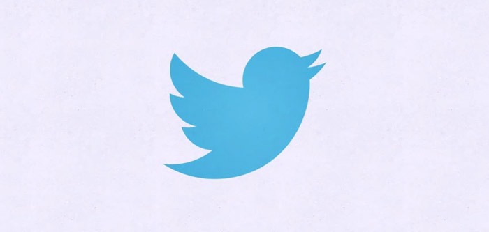
So, yesterday, Twitter rolled out an updated logo. The little blue bird has already become synonymous with "Twitter" but they decided he needed a bit of a facelift. The new logo is intentionally geometric, slightly upturned, slimmer and has less of a hairstyle than the previous version. Like any good Internet Nerd I'm a bit baffled by why they felt the need to change the logo at all; especially to something that doesn't really strike me as an improvement but rather just a change for change sake. Weren't projects like this enough to inspire keeping the old logo? Seems like it was so well known!
Oh well, at the very least we get some good Batman jokes out of the new look and that's alright by me.
Oh well, at the very least we get some good Batman jokes out of the new look and that's alright by me.